I did not expect to like “Batman: Black and White”. As a comic book, the art is too solid, the people are too realistic and the facial expressions are just unsettling. This art style was very noticeable in Batman: Black and White and it distracted me throughout the whole thing. A comic book is normally fictional so I believe the people should look fictional too! The artist has the opportunity to make people look better than they do in real life. Some comic books, like this one, don’t take this opportunity for improvement and that’s what bothers me. A good example of art is in “Death Note”, a Japanese comic book drawn by Takeshi Obata. Although it’s a more realistic style, the artist uses less facial lines to make them smoother looking and not so scary. I just can’t see enjoying something with such distressing facial expressions.
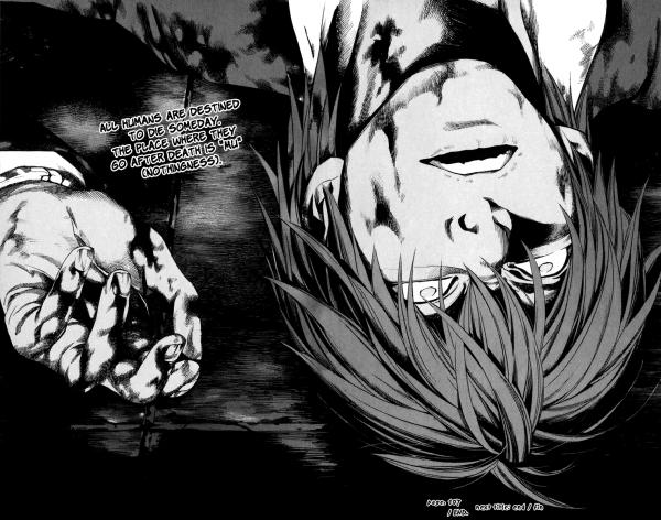
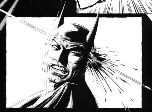
Both drawings of people dying, but which would you rather look at? Personally, I'd rather not have to nightmares for the rest of my life, so I pick number 1!
Other than the art though, I enjoyed it. Each shot was different and taken from different angles to show who was powerful, who was weak and to best display the characters’ emotions. The picture of Batman gliding through the air was very effective; I really got the sense of power that he holds.
 |
| Put on your 3D glasses, this cool shot is even in 3D now! |
 This shot also effectively used the lighting to put his face in shadow, creating a mysterious air around him. Another good shot was the medium close-up of the “innocent” guy when he’s talking about the problems with the world. You can really tell he is passionate (a little too passionate if you ask me) about what he believes. The plain black background was also done well so the reader is forced to focus on his emotion. What I really liked about this comic was the way it made you think. It brings up issues of good versus evil that makes the reader rethink what they know about society. Is everything really black and white, or are people only good because they are afraid of being caught if they’re bad? Are all people actually evil inside? Is there such thing as evil then? Unlike a lot of media today that people watch or read that kills brain cells ( like songs titled "In Da Club"), this is a good piece of literature! I believe this ability to force readers into thinking deeper is what makes a good story, whether it’s a book, song, film, manga, TV show, etcetera. Overall, “Batman: Black and White” was okay. Although the shots were good and the plot was awesome, I really couldn’t look past the artwork. I give this a 4 out of 10.
No comments:
Post a Comment